Responsive Off-canvas Sidebar Plugin For Bootstrap - sidebar.js
| File Size: | 9.87 KB |
|---|---|
| Views Total: | 8413 |
| Last Update: | |
| Publish Date: | |
| Official Website: | Go to website |
| License: | MIT |
Just another jQuery plugin used to create a responsive off-canvas sidebar/navigation for your Bootstrap project. With a smooth slide-in animation effect using CSS3 transforms and transitions. Supports both right and left sidebars. Your users are able to close the sidebar by clicking outside or clicking on the toggle button.
View more:
How to use it:
1. Make sure you have jQuery library and Bootstrap framework loaded in the document.
<link rel="stylesheet" href="/path/to/bootstrap.min.css">
<script src="/path/to/jquery.min.js"></script>
<script src="/path/to/bootstrap.min.js"></script>
2. Download the plugin and insert the following JS & CSS files in the document.
<script src="dist/js/sidebar.js"></script>
<link rel="stylesheet" href="dist/css/sidebar.css">
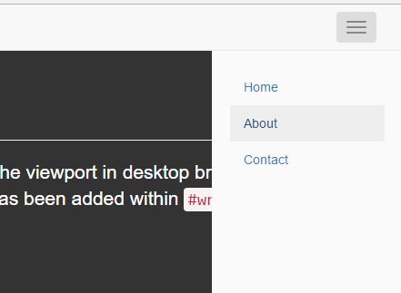
3. Create a toggle button inside your top nav to open/close the sidebar.
<div class="navbar navbar-default navbar-fixed-top">
  <div class="container-fluid">
    <div class="navbar-header">
      <button type="button" class="navbar-toggle toggle-left hidden-lg" data-toggle="sidebar" data-target=".sidebar">
        <span class="icon-bar"></span>
        <span class="icon-bar"></span>
        <span class="icon-bar"></span>
      </button>
      <a class="navbar-brand" href="#">Project name</a>
    </div>
  </div>
</div>
4. Create the off-canvas sidebar in your main content as this:
<div class="container">
  <div class="row">
    <div class="col-xs-7 col-sm-3 col-md-2 sidebar sidebar-left sidebar-animate sidebar-show-lg">
      <ul class="nav navbar-stacked">
        <li class="active"><a href="#">Home</a></li>
        <li><a href="#about">About</a></li>
        <li><a href="#contact">Contact</a></li>
      </ul>
    </div>
    <div class="main">
      <div class="page-header">
        <h1>Sticky footer with fixed navbar</h1>
      </div>
      <p class="lead">Pin a fixed-height footer to the bottom of the viewport in desktop browsers with this custom HTML and CSS. A fixed navbar has been added within <code>#wrap</code> with <code>padding-top: 60px;</code> on the <code>.container</code>.</p>
      <p>Back to <a href="../sticky-footer">the default sticky footer</a> minus the navbar.</p>
    </div>
  </div>
</div>
5. You can make the sidebar look any way you want
.sidebar {
  padding: 20px;
  background-color: #333;
  border-right: 1px solid #eee;
  ...
}
This awesome jQuery plugin is developed by asyraf9. For more Advanced Usages, please check the demo page or visit the official website.