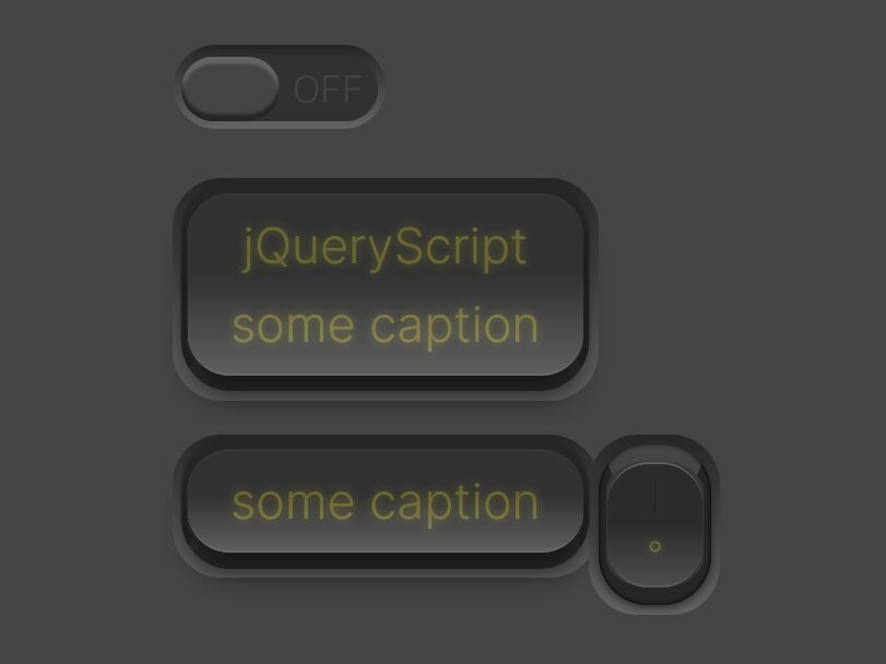
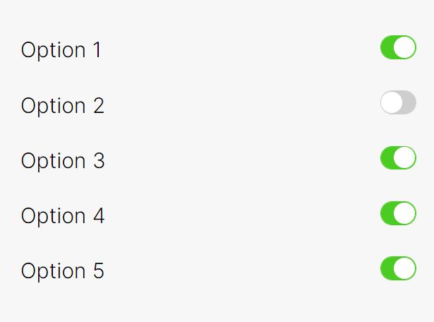
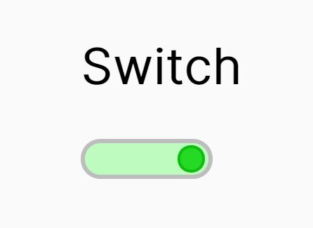
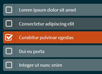
jQuery Plugin For Checkbox Based Toggle Buttons - TinyToggle
| File Size: | 633 KB |
|---|---|
| Views Total: | 8552 |
| Last Update: | |
| Publish Date: | |
| Official Website: | Go to website |
| License: | MIT |
TinyToggle contains a jQuery plugin and a web font that allows you to convert checkboxes into beautiful on / off toggle buttons / switches using Html5 data-* attributes.
Features:
- 13 different types
- 8 different sizes and palettes
- 4 callback events.
- 5 public methods
How to use it:
1. Upload the css, fonts, and js folders into your web server.
2. Import the required JavaScript and Stylesheet in your project which has jQuery library installed.
<link href="path/to/tiny-toggle.css" rel="stylesheet">
<script src="//code.jquery.com/jquery-2.1.4.min.js"></script>
<script src="path/to/tiny-toggle.js"></script>
3. Create a checkbox on your webpage.
<input type="checkbox" class="tiny-toggle">
4. Initialize the plugin to convert the checbox into a toggle switch.
$(".tiny-toggle").tinyToggle();
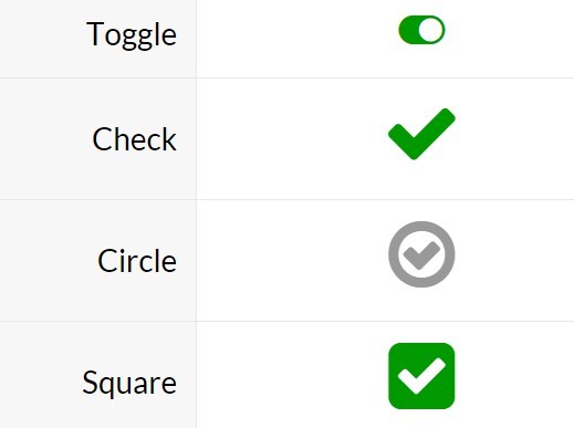
5. Change the styles of your toggle buttons. Available Html5 data attributes:
- Toggle: data-tt-type="toggle"
- Check: data-tt-type="check"
- Circle: data-tt-type="circle"
- Square: data-tt-type="square"
- Square Checked: data-tt-type="square_v"
- Power: data-tt-type="power"
- Dot: data-tt-type="dot"
- Like: data-tt-type="like"
- Watch: data-tt-type="watch"
- Star: data-tt-type="star"
- Lock: data-tt-type="lock"
- Heart: data-tt-type="heart"
- Smile: data-tt-type="smile"
<input type="checkbox" class="tiny-toggle"
       data-tt-type="check"
>
6. Change the sizes using Html5 data-tt-size attributes:
Mini: data-tt-size="mini"
Small: data-tt-size="small"
Medium: data-tt-size="medium"
Large: data-tt-size="large"
Big: data-tt-size="big"
Huge: data-tt-size="huge"
Monster: data-tt-size="monster"
Giant: data-tt-size="giant"
<input type="checkbox" class="tiny-toggle"
       data-tt-size="mini"
>
7. Change the colors using Html5 data-tt-colr attributes:
- Black: data-tt-palette="black"
- Blue: data-tt-palette="blue"
- Purple: data-tt-palette="purple"
- Red: data-tt-palette="red"
- Green: data-tt-palette="green"
- Yellow: data-tt-palette="yellow"
- White: data-tt-palette="white"
<input type="checkbox" class="tiny-toggle"
       data-tt-palette="black"
>
8. Default options and callback events.
type: 'toggle',
size: 'medium',
palette: 'standard',
colors: null,
icons: null,
disabled: false,
onReady: null,
onChange: null,
onCheck: null,
onUncheck: null
9. Public methods.
$(".tiny-toggle").tinyToggle('enable')
$(".tiny-toggle").tinyToggle('disable')
$(".tiny-toggle").tinyToggle('check')
$(".tiny-toggle").tinyToggle('uncheck')
$(".tiny-toggle").tinyToggle('toggle')
Change log:
2016-04-08
- bugfix
- Add tinyToggle Angular Directive
2016-04-01
- Add groups management
This awesome jQuery plugin is developed by EnomisTheArtist. For more Advanced Usages, please check the demo page or visit the official website.