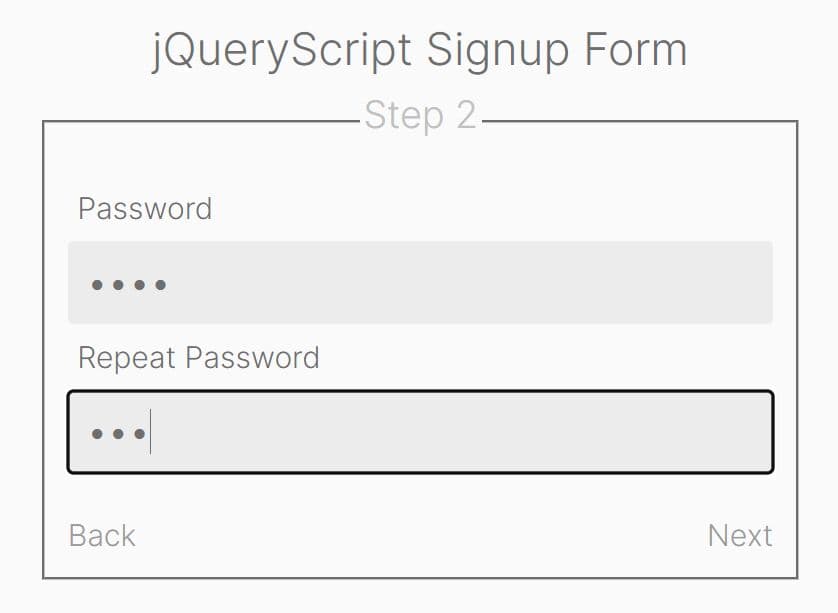
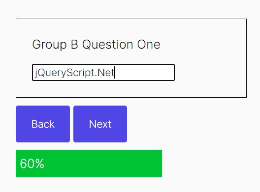
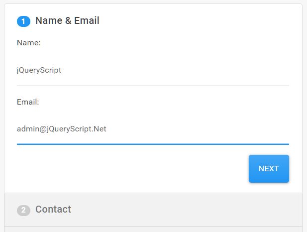
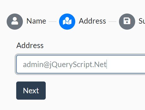
Easy Sequential Step Wizard With Data Validation - jQuery Stepform
| File Size: | 7.22 KB |
|---|---|
| Views Total: | 6976 |
| Last Update: | |
| Publish Date: | |
| Official Website: | Go to website |
| License: | MIT |
Just another jQuery form wizard plugin which displays grouped form fields in a multi-step wizard interface with data validation integrated. Great for signup forms, survey forms and more. Keyboard interaction is supported as well.
How to use it:
1. Load the following JavaScript files into the document and the Stepform plugin is ready for use.
<script src="//code.jquery.com/jquery.min.js"></script>
<script src="jq.stepform.js"></script>
2. Create your own form steps grouped by the fieldset elements with the CSS class of 'sf-step' as this:
<form class="stepform" action="" method="post">
<fieldset class="sf-step">
<legend>1. Basic Details</legend>
<p>
<label class="control-label" for="firstname">First Name</label>
<input class="form-control" id="firstname" name="firstname" data-validate="1"/>
</p>
<p>
<label class="control-label" for="lastname">Last Name</label>
<input class="form-control" id="lastname" name="lastname" data-validate="1"/>
</p>
</fieldset>
<fieldset class="sf-step">
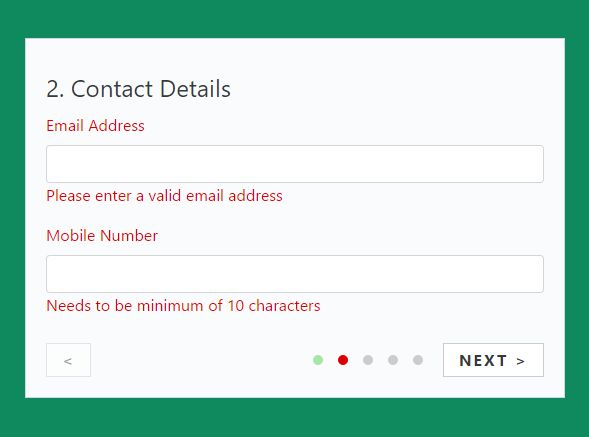
<legend>2. Contact Details</legend>
<p>
<label class="control-label" for="email">Email Address</label>
<input class="form-control" id="email" name="email" data-validate="email"/>
</p>
<p>
<label class="control-label" for="mobile">Mobile Number</label>
<input class="form-control" id="mobile" name="mobile" data-validate="10"/>
</p>
</fieldset>
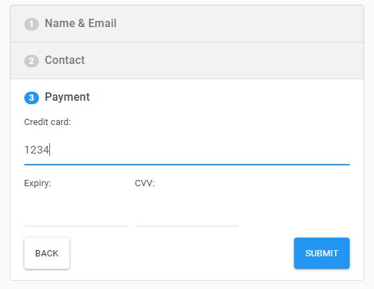
<fieldset class="sf-step">
<legend>3. Payment</legend>
<strong>Payment Mode</strong>
<p class="radio">
<label><input name="nameradio1" type="radio" value="online" />Online </label>
<label><input name="nameradio1" type="radio" value="offline"/>Offline </label>
<label><input name="nameradio1" type="radio" value="later" />Later </label>
</p>
<p>
<label class="control-label" for="namecard">Name on Card</label>
<input class="form-control" id="namecard" name="namecard" type="text" />
</p>
<p class="radio">
<label><input name="nameradio2" type="radio"/>Option 1 </label>
<label><input name="nameradio2" type="radio"/>Option 2 </label>
<label><input name="nameradio2" type="radio"/>Option 3 </label>
<label><input name="nameradio2" type="radio"/>Option 4 </label>
</p>
</fieldset>
<fieldset class="sf-step">
<legend>4. Newsletter</legend>
<p class="checkbox">
<label><input name="subscribeto" type="checkbox"/>News</label>
<label><input name="subscribeto" type="checkbox"/>Events</label>
<label><input name="subscribeto" type="checkbox"/>Jobs</label>
</p>
<p>
<label class="control-label" for="newsletter">Newsletter</label>
<select id="newsletter" name="newsletter" class="form-control">
<option value="Daily" selected>Daily</option>
<option value="Weekly">Weekly</option>
<option value="Monthly">Monthly</option>
<option value="Never">Never</option>
</select>
</p>
</fieldset>
<fieldset class="sf-step">
<legend>Confirm</legend>
<p>
Please look at the data below and confirm.
</p>
<p>Name <mark data-sf-bind="firstname"></mark> | <mark data-sf-bind="lastname"></mark></p>
<p>Email <mark data-sf-bind="email"></mark></p>
<p>Phone <mark data-sf-bind="mobile"></mark></p>
<p class="text-center">
<input type="submit" value="Submit" name='submit' class="btn btn-success">
</p>
</fieldset>
</form>
3. Available validation rules. You can apply the following data attribute to the form fields as you seen above:
- data-validate='3': requires more than 3 characters
- data-validate='email': requires a valid email address
4. Available plugin options:
$(".stepform").stepform({

  // margin in pixels
  margin    :   20,

  // class prefix
  classes   :   "sf",

  // navigation text
  navtext   :   {
    next : "NEXT >",
    prev : "<",
  },

  // enable form validation
  validate    : true,

});
5. Style the form wizard using your own CSS experiences.
.stepform {
  padding: 20px;
  background: #fafbfc;
  border: 1px solid #cfd6e7;
}

/*************** Plugin ***************/


.sf-wrapper { overflow: hidden; }

.sf-container { overflow: hidden; }

.sf-step.sf-active { margin: 10px 0; }

.sf-step { float: left; }

.sf-error { color: #DD0000; }

.sf-navigation {
  line-height: 1em;
  overflow: hidden;
  text-align: right;
}

.sf-navigation .nav-prev, .sf-navigation .nav-next {
  display: block;
  padding: 8px 15px;
  border: 1px solid #CCCCCC;
  color: #000;
  background: #FFFFFF;
  font-weight: bold;
  letter-spacing: 2px;
  text-decoration: none;
  cursor: pointer;
}

.sf-navigation .nav-prev {
  opacity: .5;
  float: left;
}

.sf-navigation .nav-next {
  float: right;
  margin-left: 5px;
}

.sf-navigation span {
  display: inline-block;
  width: 10px;
  height: 10px;
  border-radius: 10px;
  margin: 12px 15px 0 0;
  background: #CCCCCC;
}

.sf-navigation span.sf-nav-done { background: #a6e6a6; }

.sf-navigation span.sf-nav-active { background: #00CC00; }

.sf-navigation span.sf-nav-error { background: #DD0000; }
This awesome jQuery plugin is developed by masade. For more Advanced Usages, please check the demo page or visit the official website.