Touch-enabled jQuery Input Spinner Plugin For Bootstrap - TouchSpin
| File Size: | 1.47 MB |
|---|---|
| Views Total: | 30976 |
| Last Update: | |
| Publish Date: | |
| Official Website: | Go to website |
| License: | MIT |
TouchSpin is a mobile-friendly numeric input spinner library for the Bootstrap framework that adds increment and decrement controls to standard HTML input fields.
Currently supports Bootstrap 5, 4 & 3. It's ideal for developers who need precise numeric input controls in forms without building custom UI components from scratch.
The library started as a jQuery plugin and has since evolved into a framework-agnostic solution that works with vanilla JavaScript, React, Angular, Vue, Svelte, and Web Components. Our website primarily focuses on the jQuery implementation; if you'd like to integrate with other frameworks mentioned above, please refer to the official TouchSpin website.
Features:
- Touch-Optimized Controls: Mobile-friendly increment and decrement buttons that respond to both click and touch events.
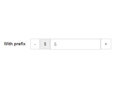
- Fully Customizable: Supports minimum and maximum boundaries, custom step intervals, decimal precision, and prefix/postfix labels for units.
- Accelerated Input: Built-in "booster" mode that increases the step value when holding down buttons for faster value changes.
- Mouse Wheel Support: Allows users to change values by scrolling over the input field with their mouse wheel.
- Vertical Button Mode: Optional traditional up/down button layout instead of the default horizontal minus/plus arrangement.
- Data Attribute Configuration: All options can be set via HTML5 data attributes for markup-driven initialization.
- Event-Driven API: Exposes custom events for programmatic control and dynamic setting updates after initialization.
Use Cases:
- E-commerce Quantity Inputs: It allows customers to easily adjust the quantity of an item in their shopping cart on both desktop and mobile.
- Booking and Reservation Forms: Perfect for selecting the number of guests, rooms, or nights, where a simple and clear numeric input is essential.
- Configuration Panels: In admin dashboards or settings pages, it provides a constrained way for users to set numerical parameters like item counts, thresholds, or limits.
- Product Filters: Useful in layered navigation for filtering products by a numeric attribute, like the number of cores in a CPU or the quantity in a pack.
See Also:
How To Use It (jQuery):
1. To get started, make sure you have jQuery and the appropriate Bootstrap CSS/JS files loaded in your project.
<link rel="stylesheet" href="/path/to/cdn/bootstrap.min.css" />
<script src="/path/to/cdn/jquery.min.js"></script>
<script src="/path/to/cdn/bootstrap.min.js"></script>
2. Load the TouchSpin CSS and the correct JavaScript file for your version of Bootstrap.
<link href="dist/jquery.bootstrap-touchspin.css" rel="stylesheet">

<!-- Bootstrap 5 -->
<script src="dist/jquery.touchspin-bootstrap5.umd.js"></script>

<!-- Bootstrap 4 -->
<script src="dist/jquery.touchspin-bootstrap4.umd.js"></script>

<!-- Bootstrap 3 -->
<script src="dist/jquery.touchspin-bootstrap3.umd.js"></script>
3. Create a standard text input in your HTML. You can give it an ID or a name for easy selection.
<input id="demo" type="text" value="99" name="demo">
4. Initialize TouchSpin on your input element. This will convert your text input into a fully functional numeric spinner with default settings.
$("input[name='demo']").TouchSpin({
  // configuration options here
});
5. All available configuration options.
initval: Sets the initial value if the input field is empty. Defaults to"".replacementval: Replaces the input's value if a user leaves it blank or enters a non-numeric value. Defaults to"".firstclickvalueifempty: Sets a value on the first button click if the input is empty. Defaults tonull.min: The minimum allowed value for the input. Defaults to0.max: The maximum allowed value for the input. Defaults to100.step: The increment or decrement value for each button press. Defaults to1.forcestepdivisibility: Forces the value to be a multiple of thestep. Options are'round','floor','ceil', or'none'. Defaults to'round'.decimals: The number of decimal places to allow. Defaults to0.stepinterval: The refresh rate in milliseconds when a button is held down. Defaults to100.stepintervaldelay: The delay in milliseconds before the spinner starts when a button is held down. Defaults to500.verticalbuttons: Iftrue, displays buttons vertically above and below the input. Defaults tofalse.verticalup: The content for the vertical up button. Defaults to'+'.verticaldown: The content for the vertical down button. Defaults to'-'.verticalupclass: Custom CSS class for the vertical up button. Defaults to"".verticaldownclass: Custom CSS class for the vertical down button. Defaults to"".prefix: Text or HTML to display before the input value. Defaults to"".postfix: Text or HTML to display after the input value. Defaults to"".prefix_extraclass: Custom CSS class for the prefix element. Defaults to"".postfix_extraclass: Custom CSS class for the postfix element. Defaults to"".booster: Iftrue, the spinner accelerates as the button is held down. Defaults totrue.boostat: The number of steps before the spinner speed increases. Defaults to10.maxboostedstep: The maximum step value when the booster is active. Defaults tofalse(no limit).mousewheel: Iftrue, allows changing the value with the mouse wheel. Defaults totrue.buttondown_class: CSS class(es) for the decrement button. Defaults to'btn btn-primary'.buttonup_class: CSS class(es) for the increment button. Defaults to'btn btn-primary'.buttondown_txt: The text or HTML content for the decrement button. Defaults to'-'.buttonup_txt: The text or HTML content for the increment button. Defaults to'+'.focusablebuttons: Iffalse, prevents the spinner buttons from gaining focus on click. Defaults tofalse.callback_before_calculation: A function that is called before a new value is calculated. It receives the current value and should return a value. Defaults to(v) => v.callback_after_calculation: A function that is called after a new value is calculated. It receives the new value and should return a value. Defaults to(v) => v.renderer: A function to customize the rendering of the TouchSpin component. Defaults tonull.
$("input[name='demo']").TouchSpin({
  min: 0,
  max: 100,
  initval: '',
  replacementval: '',
  firstclickvalueifempty: null,
  step: 1,
  decimals: 0,
  forcestepdivisibility: 'round',
  stepinterval: 100,
  stepintervaldelay: 500,
  verticalbuttons: false,
  verticalup: '+',
  verticaldown: '−',
  verticalupclass: null,
  verticaldownclass: null,
  focusablebuttons: false,
  prefix: '',
  postfix: '',
  prefix_extraclass: '',
  postfix_extraclass: '',
  booster: true,
  boostat: 10,
  maxboostedstep: false,
  mousewheel: true,
  buttonup_class: null,
  buttondown_class: null,
  buttonup_txt: '+',
  buttondown_txt: '−',
  callback_before_calculation: (v) => v,
  callback_after_calculation: (v) => v,
  renderer: null,
});
6. You can configure TouchSpin entirely through HTML5 data attributes. This can be useful for server-rendered templates.
<input id="demo"
  type="text"
  value="55"
  name="demo"
  data-bts-min="0"
  data-bts-max="100"
  data-bts-init-val=""
  data-bts-step="1"
  data-bts-decimal="0"
  data-bts-step-interval="100"
  data-bts-force-step-divisibility="round"
  data-bts-step-interval-delay="500"
  data-bts-prefix=""
  data-bts-postfix=""
  data-bts-prefix-extra-class=""
  data-bts-postfix-extra-class=""
  data-bts-booster="true"
  data-bts-boostat="10"
  data-bts-max-boosted-step="false"
  data-bts-mousewheel="true"
  data-bts-button-down-class="btn btn-secondary"
  data-bts-button-up-class="btn btn-secondary"
/>
7. API events. The following events are triggered on the original input by the plugin and can be listened on.
change: Triggered when the value is changed with one of the buttons (but not triggered when the spinner hits the limit set by settings.min or settings.max.touchspin.on.startspin: Triggered when the spinner starts spinning upwards or downwards.touchspin.on.startupspin: Triggered when the spinner starts spinning upwards.touchspin.on.startdownspin: Triggered when the spinner starts spinning downwards.touchspin.on.stopspin: Triggered when the spinner stops spinning.touchspin.on.stopupspin: Triggered when the spinner stops upspinning.touchspin.on.stopdownspin: Triggered when the spinner stops downspinning.touchspin.on.min: Triggered when the spinner hits the limit set by settings.min.touchspin.on.max: Triggered when the spinner hits the limit set by settings.max.
8. The following events can be triggered on the original input.
$("input").trigger("touchspin.uponce");
$("input").trigger("touchspin.updatesettings", {max: 1000});
touchspin.updatesettings: function(newoptions) Update any setting of an already initialized TouchSpin instance.touchspin.uponce: Increase the value by one step.touchspin.downonce: Decrease the value by one step.touchspin.startupspin: Starts the spinner upwards.touchspin.startdownspin: Starts the spinner downwards.touchspin.stopspin: Stops the spinner.
Changelog:
v5.2.0 (2025-11-02)
- Updated for Bootstrap 5
- Updated doc
- Updated demos
v4.7.1 (2023-05-25)
- Better RTL support
- Refactored vertical button handling
- Better support for initializing with existing input group addons
v4.7.0 (2023-05-25)
- Firing the min and max events as soon as the value reaches the minimum or the maximum.
v4.6.1 (2023-04-09)
- Bugfixes
v4.6.1 (2023-04-07)
- Bugfixes
v4.6.0 (2023-04-05)
- Fixing bugs with readonly inputs
v4.5.4 (2023-04-04)
- Adding support for the min/max/step attributes on an input
- If step is other than 1 then min and max values will be tweaked to be sure they are divisible by step
v4.5.0/2/3 (2023-04-04)
- Bugfixes
v4.4.0 (2023-03-30)
- Bugfix
v4.3.0 (2020-04-10)
- Bugfix
v4.2.5 (2018-04-27)
- Fixed: Starts spinning when mouse is kept hovering over button after click
v4.2.3 (2018-04-23)
- radius of input field not correct + strange borders between buttons
v4.2.0 (2018-04-15)
- Fixed TouchSpin('destroy') does not work.
v4.0.2 (2018-04-05)
- Update
v4.0.0 (2018-03-31)
- Bootstrap 4 support
v3.1.1 (2016-08-29)
- update
v3.0.1 (2016-01-19)
- update
v2.8.0 (2014-03-31)
- Cleanup and styling.
v2.7.1 (2014-03-30)
- Fixed updatesettings with empty inputs.
v2.6.1 (2014-01-29)
- reverting latest changes...
v2.5.1 (2014-01-29)
- fixed: IE9 resizes some input on hovering +- buttons
v2.4.0 (2013-12-13)
- update to the latest version.
v2.3.0 (2013-12-12)
- new setting: initval
v2.2.0 (2013-12-11)
- Fixed: Need setting for button class
v2.1.0 (2013-12-06)
- Support for different input sizes
v2.0.0 (2013-12-04)
- The plugin now can be initialized on an input-group.
v1.3.5 (2013-12-03)
- fixed: Update settings after initialization
v1.3.4 (2013-11-26)
- Now can add extra class(es) for prefix and postfix.
v1.3.3 (2013-11-22)
- fixed can't init with empty value
v1.3.0 (2013-10-31)
- Improved touch event handling.
v1.2.1 (2013-10-11)
- Added decimal support.
- Fixed android bug with body background image save popup when holding the buttons.
v1.1.0 (2013-10-10)
- fixed mousewheel
This awesome jQuery plugin is developed by istvan-ujjmeszaros. For more Advanced Usages, please check the demo page or visit the official website.