Responsive Multi Level Navigation with CSS3 Transitions - BootM
| File Size: | 30.5KB |
|---|---|
| Views Total: | 23943 |
| Last Update: | |
| Publish Date: | |
| Official Website: | Go to website |
| License: | MIT |
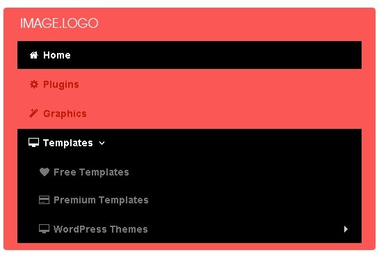
BootM is a pure-CSS menu system for creating responsive, cross-browser and mobile-friendly multi-level navigation menus with CSS3 transitions. It built only with CSS and bootstrap framework, without writing any javascript.
How to use it:
1. Include required CSS files on the web page
<link href="css/bootstrap.min.css" rel="stylesheet">
<link href="css/font-awesome.css" rel="stylesheet">
<!--[if IE 7]>
<link href="//netdna.bootstrapcdn.com/font-awesome/3.0.2/css/font-awesome-ie7.css" rel="stylesheet">
<![endif]-->
2. Include HTML5 shim for IE6-8 Support
<!--[if lt IE 9]>
<script src="http://html5shim.googlecode.com/svn/trunk/html5.js"></script>
<![endif]-->
3. Create the navigation menu
<div class="navbar">
<div class="navbar-inner PL0 PT20">
<div class="container">
<div class="nav-collapse collapse navbar-responsive-collapse">
<ul class="nav">
<li class="active"><a href="#" class="make-round">Home</a></li>
<li><a href="#">Plugins</a></li>
<li><a href="#">Graphics</a></li>
<li class="dropdown"> <a href="#" class="dropdown-toggle" data-toggle="dropdown">Templates<i class="icon-angle-down"></i></a>
<ul class="dropdown-menu">
<li><a href="#">Free Templates</a></li>
<li><a href="#">Premium Templates</a></li>
<li class="dropdown-submenu"> <a tabindex="-1" href="#">WordPress Themes</a>
<ul class="dropdown-menu">
<li><a href="#">Free WordPress Themes</a></li>
<li><a href="#">Premium WordPress Themes</a></li>
</ul>
</li>
</ul>
</li>
</ul>
</div>
<!-- /.nav-collapse -->
</div>
</div>
<!-- /navbar-inner -->
</div>
4. The CSS
.navbar-inner {
border: 0px solid #FB5755;
background: #FB5755;
}
.navbar .nav>li {
border-right: 0px;
-webkit-transition: all 300ms;
-moz-transition: all 300ms;
-ms-transition: all 300ms;
-o-transition: all 300ms;
transition: all 300ms;
}
.navbar .nav>li:hover {
background: rgb(0, 0, 0);
color: #fff;
}
.navbar .nav a {
font-style: normal !important;
font-weight: bold;
}
.navbar .nav>li:hover > a {
color: #fff;
}
.navbar .nav>li>a:focus, .navbar .nav>li>a:hover {
color: #fff;
}
/* disabled link */
.dropdown-menu>.disabled>a, .dropdown-menu>.disabled>a:hover, .dropdown-menu>.disabled>a:focus {
color: rgb(100, 100, 100);
border: 1px solid transparent;
-webkit-box-shadow: 0 0 0;
-moz-box-shadow: 0 0 0;
-ms-box-shadow: 0 0 0;
-o-box-shadow: 0 0 0;
box-shadow: 0 0 0;
}
.navbar .nav>li:last-child {
}
/* active link */
.navbar .nav>.active>a, .navbar .nav>.active>a:hover, .navbar .nav>.active>a:focus {
color: #fff;
text-decoration: none;
background: rgb(0, 0, 0);
}
/*  */
.navbar .nav>li>a {
float: none;
padding: 10px 15px 10px;
color: rgb(192, 28, 7);
text-shadow: 0 0 0;
}
/* dropdown */
.dropdown-menu {
padding: 5px 0;
border: 0px solid #000;
margin-top: 0px;
background: #FB5755;
-webkit-border-radius: 0px 0px 4px 4px;
-moz-border-radius: 0px 0px 4px 4px;
border-radius: 0px 0px 4px 4px;
}
.dropdown-menu>li>a {
padding: 7px 20px;
color: rgb(192, 28, 7);
border-top: 1px solid transparent;
border-bottom: 1px solid transparent;
}
.dropdown-menu>li>a:hover, .dropdown-menu>li>a:focus, .dropdown-submenu:hover>a, .dropdown-submenu:focus>a {
color: rgb(255, 255, 255);
text-decoration: none;
background: rgb(0, 0, 0);
}
/*  shows the dropdown on hover*/
.navbar ul.nav li:hover > ul.dropdown-menu {
display: block;
}
/* before and after */
.navbar .nav > li > .dropdown-menu::before, .navbar .nav > li > .dropdown-menu::after {
display: none;
}
/* utilities */
.text-left {
text-align: left;
}
.text-center {
text-align: center;
}
.text-right {
text-align: right;
}

/* *******************************************************************
 * Responsive Media                                                  *
 * *******************************************************************/
/* Large desktop */
@media (min-width: 1200px) {
}
 @media (min-width: 1024px) and (max-width: 1100px) {
.navbar-search .search-query:focus {
width: 70px;
}
}


/* Portrait tablet to landscape and desktop */
@media (min-width: 768px) and (max-width: 979px) {
.PL0 {
padding-left: 20px;
}
.PT20 {
padding-top: 20px;
}
.navbar .brand {
padding-bottom: 18px;
}
/* link background */
.nav-collapse .nav>li>a:hover, .nav-collapse .dropdown-menu a:hover {
background: rgba(0, 0, 0, 0.55);
}
/* active link */
.nav-collapse .nav>li>a, .nav-collapse .dropdown-menu a {
-webkit-border-radius: 0;
-moz-border-radius: 0;
border-radius: 0;
}
.nav.social-icons {
text-align: center;
}
.nav.social-icons li {
float: none;
display: inline-block;
border: 1px solid #000;
}
.nav-collapse .navbar-form, .nav-collapse .navbar-search {
border: 0;
}
/* search form */
.navbar-search {
text-align: center;
}
.navbar-search .search-query {
width: 100px;
border: 1px solid #000;
}
.nav-collapse, .nav-collapse.collapse {
height: auto;
overflow: hidden;
}
}

/* Landscape phone to portrait tablet */
@media (max-width: 767px) {
.navbar .brand {
padding-bottom: 18px;
}
.PL0 {
padding-left: 20px;
}
.PT20 {
padding-top: 20px;
}
/* link background */
.nav-collapse .nav>li>a:hover, .nav-collapse .dropdown-menu a:hover {
background: rgba(0, 0, 0, 0.55);
}
/* active link */
.nav-collapse .nav>li>a, .nav-collapse .dropdown-menu a {
-webkit-border-radius: 0;
-moz-border-radius: 0;
border-radius: 0;
}
.nav.social-icons {
text-align: center;
}
.nav.social-icons li {
float: none;
display: inline-block;
border: 1px solid #000;
}
.nav-collapse .navbar-form, .nav-collapse .navbar-search {
border: 0;
}
/* search form */
.navbar-search {
text-align: center;
}
.navbar-search .search-query {
width: 100px;
border: 1px solid #000;
}
.nav-collapse, .nav-collapse.collapse {
height: auto;
overflow: hidden;
}
}

/* Landscape phones and down */
@media (max-width: 480px) {
.nav-collapse, .nav-collapse.collapse {
height: auto;
overflow: hidden;
}
}
More Examples:
This awesome jQuery plugin is developed by egrappler. For more Advanced Usages, please check the demo page or visit the official website.