Vertical Responsive Multi-level Nav Menu with jQuery and CSS3
| File Size: | 2.09 KB |
|---|---|
| Views Total: | 32416 |
| Last Update: | |
| Publish Date: | |
| Official Website: | Go to website |
| License: | MIT |
A simple jQuery & CSS3 based menu system used to create a mobile-friendly, vertical, multi-level navigation menu for your responsive website. On mobile or other small screen devices (<640px by default), the plugin will convert the vertical navigation menu into a drop down menu with a toggle bar.
How to use it:
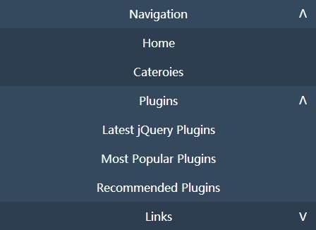
1. Create a normal navigation menu using nested Html unordered lists. The markup structure should look like this:
<nav>
  <div class="nav-toggle dropdown"><a>Navigation</a></div>
  <ul>
    <li><a href="#">Home</a></li>
    <li><a href="#">Cateroies</a></li>
    <li class="dropdown"><a>Plugins</a>
      <ul>
        <li><a href="https://www.jqueryscript.net/jquery-plugins/">Latest jQuery Plugins</a></li>
        <li><a href="https://www.jqueryscript.net/popular/">Most Popular Plugins</a></li>
        <li><a href="https://www.jqueryscript.net/recommended/">Recommended Plugins</a></li>
      </ul>
    </li>
    <li class="dropdown"><a>Links</a>
      <ul>
        <li><a href="#">Blog</a></li>
        <li><a href="#">About</a></li>
        <li><a href="#">Contact</a></li>
      </ul>
    </li>
    <li><a href="#">What's Hot</a></li>
    <li class="dropdown"><a>Keep in touch</a>
      <ul>
        <li><a href="#">Twitter</a></li>
        <li><a href="#">Google+</a></li>
        <li><a href="#">Facebook</a></li>
      </ul>
    </li>
  </ul>
</nav>
2. The core CSS/CSS3 rules to style the navigation menu.
nav { background-color: #2c3e50; }

nav ul {
  margin: 0;
  padding: 0;
  list-style: none;
  display: none;
}

nav li,
nav .nav-toggle {
  text-align: center;
  position: relative;
  display: inline-block;
  cursor: pointer;
  width: 100%;
}

nav .dropdown > a:after {
  content: 'V';
  position: absolute;
  right: 15px;
  -webkit-transform: scaleY(1);
  -ms-transform: scaleY(1);
  transform: scaleY(1);
  -webkit-transition: -webkit-transform 0.2s ease;
  transition: transform 0.2s ease;
}

nav .dropdown.open,
.desktop nav li:hover { background-color: #34495e; }

nav .dropdown.open > a:after,
.desktop nav li:hover > a:after {
  -webkit-transform: scaleY(-1);
  -ms-transform: scaleY(-1);
  transform: scaleY(-1);
}

nav .dropdown ul {
  position: relative;
  background-color: #34495e;
  display: none;
}

nav a {
  display: block;
  padding: 10px 15px;
}

.desktop nav { width: 150px; }

.desktop nav li {
  text-align: left;
  width: 150px;
}

.desktop nav li:hover ul {
  -webkit-transform: scaleY(1);
  -ms-transform: scaleY(1);
  transform: scaleY(1);
  visibility: visible;
}

.desktop nav .dropdown:hover > a:after {
  -webkit-transform: rotate(90deg);
  -ms-transform: rotate(90deg);
  transform: rotate(90deg);
}

.desktop nav .dropdown > a:after {
  content: '>';
  -webkit-transform: rotate(0deg);
  -ms-transform: rotate(0deg);
  transform: rotate(0deg);
  -webkit-transition: -webkit-transform 0.2s ease;
  transition: transform 0.2s ease;
}

.desktop nav .dropdown ul {
  top: 0;
  left: 150px;
  position: absolute;
  display: block !important;
  visibility: hidden;
  -webkit-transform: scaleY(0);
  -ms-transform: scaleY(0);
  transform: scaleY(0);
  -webkit-transform-origin: top;
  -ms-transform-origin: top;
  transform-origin: top;
  -webkit-transition: -webkit-transform 0.2s ease;
  transition: transform 0.2s ease;
}

.desktop nav .nav-toggle { display: none; }
3. Load the latest version of jQuery library at the bottom of the document.
<script src="//code.jquery.com/jquery-1.11.1.min.js"></script>
4. The Javascript to enable the mobile-friendly navigation menu and customize the breakpoint and animation delay at the beginning:
var dropdown = 'nav li:has(ul)',
    dropdown_ul = 'nav li ul',
    nav_ul = 'nav > ul',
    nav_toggle = 'nav .nav-toggle',
    open_class = 'open',
    desktop_class = 'desktop',
    breakpoint = 640, // 640px
    anim_delay = 200; // animation delay in ms


function isDesktop() {
  return ($(window).width() > breakpoint);
}


$(function() {
  $(document).click(function(e) {
    var target = $(e.target).parent();
    var target_ul = target.children('ul');

    if (!isDesktop()) {
      $(dropdown).not(target).removeClass(open_class);
      $(dropdown_ul).not(target_ul).slideUp(anim_delay);

      if (target.is(dropdown)) {
        target.toggleClass(open_class);
        target_ul.slideToggle(anim_delay);
      }

      if (target.is(nav_toggle)) {
        target.toggleClass(open_class);
        $(nav_ul).slideToggle(anim_delay);
      }
    }
  })

  $(window).resize(function() {
    $('body').toggleClass(desktop_class, isDesktop());

    if (isDesktop()) {
      $(dropdown).removeClass(open_class);
      $(dropdown_ul).hide();
      $(nav_toggle).addClass(open_class);
      $(nav_ul).show();
    }
  });

  $(window).resize();
});
This awesome jQuery plugin is developed by grit96. For more Advanced Usages, please check the demo page or visit the official website.