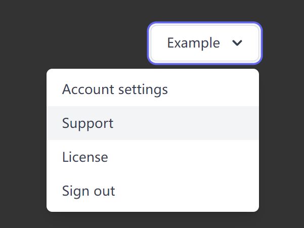
Interactive Select Menu For Small Screens
| File Size: | 7.05 KB |
|---|---|
| Views Total: | 1220 |
| Last Update: | |
| Publish Date: | |
| Official Website: | Go to website |
| License: | MIT |
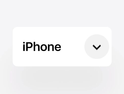
An interactive, select-based menu system where the users can switch between menu items on click, with horizontal or vertical scrolling effect. Built with jQuery, CSS animations and transforms.
Great for small screen devices (wearables, touch bars, fitness trackers, etc) where there is no enough place to show all items at once.
How to use it:
1. Create a normal select element and specify the scroll direction in the data-menu attribute:
<select data-menu="vertical">
  <option selected>JavaScript</option>
  <option>jQuery</option>
  <option>Vanilla</option>
  <option>Angular</option>
  <option>React</option>
  <option>Vue</option>
</select>

<select data-menu="horizontal">
  <option selected>JavaScript</option>
  <option>jQuery</option>
  <option>Vanilla</option>
  <option>Angular</option>
  <option>React</option>
  <option>Vue</option>
</select>
2. Load the main script after jQuery library but before the closing body tag.
<script src='/path/to/jquery.min.js'></script>
<script src="/path/to/script.js"></script>
3. The core CSS styles for the select menu. Copy and paste the following CSS snippets into your page. That's it.
.select-menu {
  --background: #fff;
  --text: #171C28;
  --icon: #3F4656;
  --shadow: rgba(18, 22, 33, .2);
  position: relative;
}
.select-menu select,
.select-menu button {
  font-family: 'Mukta Malar', Arial;
  font-weight: 500;
  font-size: 14px;
  line-height: 21px;
  margin: 0;
  border: 0;
  outline: 0;
  text-align: left;
  text-transform: none;
  -webkit-appearance: none;
}
.select-menu select {
  pointer-events: none;
  -webkit-user-select: none;
     -moz-user-select: none;
      -ms-user-select: none;
          user-select: none;
  opacity: 0;
  padding: 8px 36px 8px 10px;
  visibility: hidden;
}
.select-menu button {
  position: absolute;
  left: 0;
  top: 0;
  right: 0;
  bottom: 0;
  padding: 0;
  width: 100%;
  display: block;
  cursor: pointer;
  overflow: hidden;
  border-radius: 6px;
  box-shadow: 0 4px 12px var(--shadow);
  color: var(--text);
  background: var(--background);
}
.select-menu button div {
  position: relative;
}
.select-menu button div span {
  display: block;
  padding: 8px 32px 8px 10px;
}
.select-menu button div span.next {
  position: absolute;
  width: 100%;
}
.select-menu button em {
  --r: 45deg;
  display: block;
  position: absolute;
  right: 12px;
  top: 50%;
  width: 7px;
  height: 7px;
  margin-top: -4px;
}
.select-menu button em:before {
  content: '';
  width: 7px;
  height: 7px;
  display: block;
  -webkit-transform: rotate(var(--r)) scale(0.75);
          transform: rotate(var(--r)) scale(0.75);
  border-right: 2px solid var(--icon);
  border-bottom: 2px solid var(--icon);
}
.select-menu.vertical button div {
  display: flex;
}
.select-menu.vertical button div span {
  left: 0;
  bottom: 100%;
}
.select-menu.horizontal button div {
  display: flex;
}
.select-menu.horizontal button div span {
  right: 100%;
  top: 0;
}
.select-menu.horizontal button em {
  --r: -45deg;
  margin-top: -3px;
}
.select-menu.change button {
  -webkit-animation: bounce-vertical .45s linear;
          animation: bounce-vertical .45s linear;
}
.select-menu.change button div {
  -webkit-animation: button-vertical .6s linear forwards .05s;
          animation: button-vertical .6s linear forwards .05s;
}
.select-menu.change button em {
  -webkit-animation: arrow-vertical .45s linear;
          animation: arrow-vertical .45s linear;
}
.select-menu.change.horizontal button {
  -webkit-animation-name: bounce-horizontal;
          animation-name: bounce-horizontal;
}
.select-menu.change.horizontal button div {
  -webkit-animation-name: button-horizontal;
          animation-name: button-horizontal;
}
.select-menu.change.horizontal button em {
  -webkit-animation-name: arrow-horizontal;
          animation-name: arrow-horizontal;
}

@-webkit-keyframes bounce-vertical {
  20% {
    -webkit-transform: translateY(0);
            transform: translateY(0);
  }
  50% {
    -webkit-transform: translateY(2px);
            transform: translateY(2px);
    box-shadow: 0 2px 8px var(--shadow);
  }
}

@keyframes bounce-vertical {
  20% {
    -webkit-transform: translateY(0);
            transform: translateY(0);
  }
  50% {
    -webkit-transform: translateY(2px);
            transform: translateY(2px);
    box-shadow: 0 2px 8px var(--shadow);
  }
}
@-webkit-keyframes bounce-horizontal {
  20% {
    -webkit-transform: translateX(0);
            transform: translateX(0);
  }
  50% {
    -webkit-transform: translateX(2px);
            transform: translateX(2px);
    box-shadow: 0 8px 12px var(--shadow);
  }
}
@keyframes bounce-horizontal {
  20% {
    -webkit-transform: translateX(0);
            transform: translateX(0);
  }
  50% {
    -webkit-transform: translateX(2px);
            transform: translateX(2px);
    box-shadow: 0 8px 12px var(--shadow);
  }
}
@-webkit-keyframes button-vertical {
  40% {
    -webkit-transform: translateY(108%);
            transform: translateY(108%);
  }
  75% {
    -webkit-transform: translateY(99%);
            transform: translateY(99%);
  }
  100% {
    -webkit-transform: translateY(100%);
            transform: translateY(100%);
  }
}
@keyframes button-vertical {
  40% {
    -webkit-transform: translateY(108%);
            transform: translateY(108%);
  }
  75% {
    -webkit-transform: translateY(99%);
            transform: translateY(99%);
  }
  100% {
    -webkit-transform: translateY(100%);
            transform: translateY(100%);
  }
}
@-webkit-keyframes button-horizontal {
  40% {
    -webkit-transform: translateX(104%);
            transform: translateX(104%);
  }
  75% {
    -webkit-transform: translateX(99%);
            transform: translateX(99%);
  }
  100% {
    -webkit-transform: translateX(100%);
            transform: translateX(100%);
  }
}
@keyframes button-horizontal {
  40% {
    -webkit-transform: translateX(104%);
            transform: translateX(104%);
  }
  75% {
    -webkit-transform: translateX(99%);
            transform: translateX(99%);
  }
  100% {
    -webkit-transform: translateX(100%);
            transform: translateX(100%);
  }
}
@-webkit-keyframes arrow-vertical {
  20% {
    -webkit-transform: translateY(var(--h));
            transform: translateY(var(--h));
    -webkit-filter: blur(0.5px);
            filter: blur(0.5px);
    opacity: 1;
  }
  21% {
    -webkit-transform: translateY(var(--h));
            transform: translateY(var(--h));
    opacity: 0;
  }
  22% {
    -webkit-transform: translateY(calc(var(--h) * -1));
            transform: translateY(calc(var(--h) * -1));
    opacity: 0;
  }
  23% {
    -webkit-transform: translateY(calc(var(--h) * -1));
            transform: translateY(calc(var(--h) * -1));
    opacity: 1;
  }
  50% {
    -webkit-transform: translateY(4px);
            transform: translateY(4px);
    -webkit-filter: blur(0);
            filter: blur(0);
  }
  100% {
    -webkit-transform: translateY(0);
            transform: translateY(0);
  }
}
@keyframes arrow-vertical {
  20% {
    -webkit-transform: translateY(var(--h));
            transform: translateY(var(--h));
    -webkit-filter: blur(0.5px);
            filter: blur(0.5px);
    opacity: 1;
  }
  21% {
    -webkit-transform: translateY(var(--h));
            transform: translateY(var(--h));
    opacity: 0;
  }
  22% {
    -webkit-transform: translateY(calc(var(--h) * -1));
            transform: translateY(calc(var(--h) * -1));
    opacity: 0;
  }
  23% {
    -webkit-transform: translateY(calc(var(--h) * -1));
            transform: translateY(calc(var(--h) * -1));
    opacity: 1;
  }
  50% {
    -webkit-transform: translateY(4px);
            transform: translateY(4px);
    -webkit-filter: blur(0);
            filter: blur(0);
  }
  100% {
    -webkit-transform: translateY(0);
            transform: translateY(0);
  }
}
@-webkit-keyframes arrow-horizontal {
  20% {
    -webkit-transform: translateX(var(--w));
            transform: translateX(var(--w));
    -webkit-filter: blur(0.5px);
            filter: blur(0.5px);
    opacity: 1;
  }
  21% {
    -webkit-transform: translateX(var(--w));
            transform: translateX(var(--w));
    opacity: 0;
  }
  22% {
    -webkit-transform: translateX(calc(var(--w) * -1));
            transform: translateX(calc(var(--w) * -1));
    opacity: 0;
  }
  23% {
    -webkit-transform: translateX(calc(var(--w) * -1));
            transform: translateX(calc(var(--w) * -1));
    opacity: 1;
  }
  50% {
    -webkit-transform: translateX(4px);
            transform: translateX(4px);
    -webkit-filter: blur(0);
            filter: blur(0);
  }
  100% {
    -webkit-transform: translateX(0);
            transform: translateX(0);
  }
}
@keyframes arrow-horizontal {
  20% {
    -webkit-transform: translateX(var(--w));
            transform: translateX(var(--w));
    -webkit-filter: blur(0.5px);
            filter: blur(0.5px);
    opacity: 1;
  }
  21% {
    -webkit-transform: translateX(var(--w));
            transform: translateX(var(--w));
    opacity: 0;
  }
  22% {
    -webkit-transform: translateX(calc(var(--w) * -1));
            transform: translateX(calc(var(--w) * -1));
    opacity: 0;
  }
  23% {
    -webkit-transform: translateX(calc(var(--w) * -1));
            transform: translateX(calc(var(--w) * -1));
    opacity: 1;
  }
  50% {
    -webkit-transform: translateX(4px);
            transform: translateX(4px);
    -webkit-filter: blur(0);
            filter: blur(0);
  }
  100% {
    -webkit-transform: translateX(0);
            transform: translateX(0);
  }
}
This awesome jQuery plugin is developed by Aaron Iker. For more Advanced Usages, please check the demo page or visit the official website.