jQuery Customizable Checkboxes and Radio Buttons Plugin - wCheck
| File Size: | 104 KB |
|---|---|
| Views Total: | 2367 |
| Last Update: | |
| Publish Date: | |
| Official Website: | Go to website |
| License: | MIT |
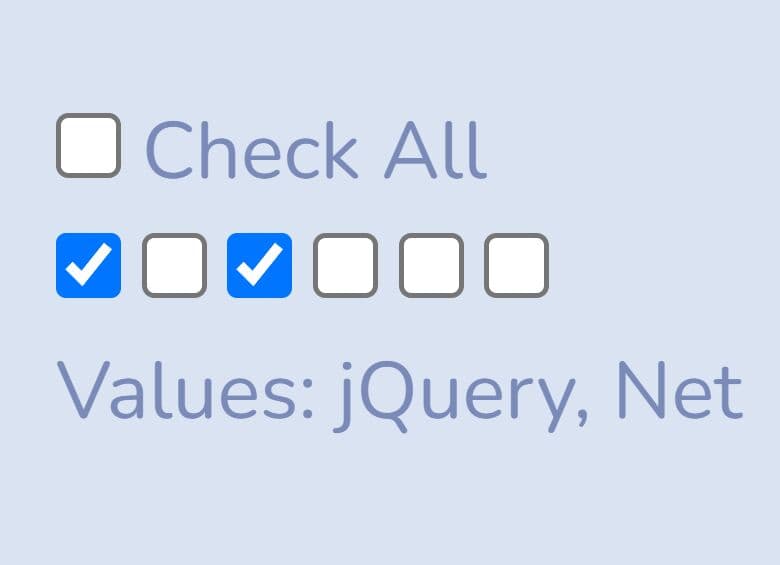
wCheck is a simple jQuery plugin that allows to use images for background themes and selectors to beautify and customize the default form checkboxes and radio buttons.
See also:
- Powerful jQuery Checkbox and Radio Button Enhancing Plugin - rlchecked
- Default Checkbox Replacement Plugin - jQuery prettyCheckable
- jQuery Plugin For Customizing Checkbox - betterCheckbox
- jQuery Plugin For Beautifying Checkboxes And Radio Buttons - iCheck
- Simple jQuery Checkboxes and Radios Replacement Plugin - Picker
- Touch-Friendly Checkboxes and Radios Replacement Plugin - CheckABox
Basic Usage:
1. Include jQuery library in the head section of your page
<script src="http://ajax.googleapis.com/ajax/libs/jquery/1.9.1/jquery.min.js"></script>
2. Include jQuery wCheck plugin on the page, after jQuery library
<script type="text/javascript" src="wCheck.js"></script>
3. Include required jQuery wCheck css file on the page
<link rel="Stylesheet" type="text/css" href="wCheck.css" />
4. Create the html
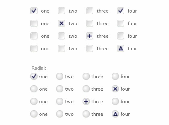
<input id="radio-test1_1" type="radio" name="radio-test1" value="one" checked="checked" />
<label for="radio-test1_1">one</label>
<input id="radio-test1_2" type="radio" name="radio-test1" value="two" />
<label for="radio-test1_2">two</label>
<input id="radio-test1_3" type="radio" name="radio-test1" value="three" />
<label for="radio-test1_3">three</label>
<input id="radio-test1_4" type="radio" name="radio-test1" value="four" />
<label for="radio-test1_4">four</label>
5. The javascript.
<script type="text/javascript">
$('input:radio[name=radio-test1]').wRadio({
theme: 'circle-classic-red',
selector: 'circle-dot-red'
});
</script>
6. Checkbox defaults.
theme: 'square-classic blue',   // theme
selector: 'checkmark',          // selector
disabled: false,                // toggle enabled/disabled
highlightLabel: false           // toggle highlighting active/hover label
7. Radio button defaults.
theme: 'circle-classic blue',   // theme
selector: 'circle-dot-blue',    // selector
disabled: false,// toggle enabled/disabled
useExistingLabel: true, // if there is a for="id" matching use it
highlightLabel: false   // toggle highlighting active/hover label
Change log:
v1.4.0 (2014-04-15)
- Added disabled support.
v1.3.0 (2013-07-09)
- some code cleanup from recent changes
This awesome jQuery plugin is developed by websanova. For more Advanced Usages, please check the demo page or visit the official website.