Beautify Select Box Using Bootstrap Dropdown Component - feastselect
| File Size: | 19.5 KB |
|---|---|
| Views Total: | 1832 |
| Last Update: | |
| Publish Date: | |
| Official Website: | Go to website |
| License: | MIT |
Ever wanted to beautify your <select> element? If you're designing a project and like to keep it 100% Bootstrap compatible, then this jQuery plugin will definitely be a useful tool.
feastselect is a lightweight jQuery plugin that converts the normal select box into a Bootstrap dropdown component with extra customizaiton options. Compatible with the latest Bootstrap 5 and Bootstrap 4.
See Also:
How to use it:
1. To get started, load the latest jQuery library and Bootstrap framework in the document.
<link rel="stylesheet" href="/path/to/cdn/bootstrap.min.css" />
<script src="/path/to/cdn/jquery.min.js"></script>
<script src="/path/to/cdn/bootstrap.bundle.min.js"></script>
2. Download and load the feastselect plugin after jQuery.
<link rel="stylesheet" type="text/css" href="dist/feastSelect.css" />
<script src="dist/feastSelect.js"></script>
3. Initialize the plugin using the data-feast-select attribute:
<select class="form-control" name="example" data-feast-select>
  <option>Languages<option>
  <option value="1">JavaScript<option>
  <option value="2">HTML5<option>
  <option value="3">CSS3<option>
</select>
4. Or via JavaScript:
<select class="form-control" name="example">
  <option>Languages<option>
  <option value="1">JavaScript<option>
  <option value="2">HTML5<option>
  <option value="3">CSS3<option>
</select>
$('select').FeastSelect({
  // options here
});
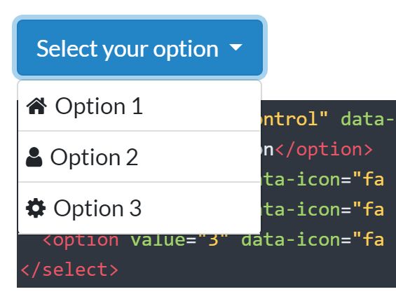
5. Add custom icons (Font Awesome icons in this example) to options.
<select class="form-control" name="example" data-feast-select>
  <option>Languages<option>
  <option value="1" data-icon="fa fa-js">JavaScript<option>
  <option value="2" data-icon="fa fa-html5">HTML5<option>
  <option value="3" data-icon="fa fa-css3">CSS3<option>
</select>

<!-- Icons At The End Of The Options -->
<select class="form-control" name="example" data-feast-select data-icon-place="right">
  <option>Languages<option>
  <option value="1" data-icon="fa fa-js">JavaScript<option>
  <option value="2" data-icon="fa fa-html5">HTML5<option>
  <option value="3" data-icon="fa fa-css3">CSS3<option>
</select>
6. Customize the button text of the dropdown.
<select class="form-control" name="example" data-btn-text="Select a language">
  <option>Languages<option>
  <option value="1" data-icon="fa fa-js">JavaScript<option>
  <option value="2" data-icon="fa fa-html5">HTML5<option>
  <option value="3" data-icon="fa fa-css3">CSS3<option>
</select>
7. Apply additional CSS classes to the dropdown.
<select class="form-control" name="example" data-btn-class="btn-lg btn-danger">
  <option>Languages<option>
  <option value="1" data-icon="fa fa-js">JavaScript<option>
  <option value="2" data-icon="fa fa-html5">HTML5<option>
  <option value="3" data-icon="fa fa-css3">CSS3<option>
</select>
8. Specify the open/close animations: fade, hide, slideDown.
<select class="form-control" name="example" data-show-effect="fade" data-hide-effect="fade">
  <option>Languages<option>
  <option value="1" data-icon="fa fa-js">JavaScript<option>
  <option value="2" data-icon="fa fa-html5">HTML5<option>
  <option value="3" data-icon="fa fa-css3">CSS3<option>
</select>
9. You can also config the dropdown by passing the following options to the FeastSelect method.
$('select').FeastSelect({
  btnClass      : 'btn-info',
  btnText       : 'Select your option',
  showEffect    : 'slideDown',
  hideEffect    : 'slideUp',
  iconPlace     : 'left',
  hideOriginal  : true, // hide the original select
});
10. Create your own themes.
.myTheme {
  /* Button styles */
}

.myTheme + .dropdown-menu {
  /* Dropdown styles */
}

// change all select styles
[class*="feastSelect_"] + .dropdown-menu {
  /* Dropdown styles */
}
This awesome jQuery plugin is developed by web-stair. For more Advanced Usages, please check the demo page or visit the official website.