Touch-friendly Switch Buttons For Bootstrap 4 - switchButton
| File Size: | 43.9 KB |
|---|---|
| Views Total: | 8734 |
| Last Update: | |
| Publish Date: | |
| Official Website: | Go to website |
| License: | MIT |
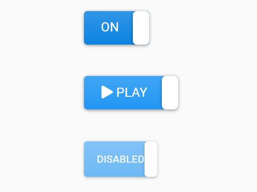
switchButton is a Bootstrap 4 plugin (< 4kb minified) that transforms the normal checkbox element into responsive, mobile-friendly, customizable switches and toggle buttons for the better experience.
Features:
- Custom on/off labels.
- Custom styles using your own CSS.
- 4 sizes: large, normal, small, mini.
- Smooth toggle transitions.
- Useful API methods and events.
See also:
How to use it:
1. Install and download.
# Yarn
$ yarn add bootstrap-switch-button

# NPM
$ npm install bootstrap-switch-button --save
2. Import the Bootstrap Switch Button's files into your Bootstrap project.
<link href="/path/to/bootstrap-switch-button.min.css" rel="stylesheet">
<script src="/path/to/bootstrap-switch-button.min.js"></script>
3. Autmatically initialize the plugin on the checkbox element using the data-toggle attribute.
<input id="example" type="checkbox" data-toggle="switchbutton">
4. Or initialize the plugin via JavaScript:
<input id="example" type="checkbox">
$(function(){
  $('#example').switchButton();
});
5. Customize the on/off label. HTML content is supported.
<input type="checkbox"
       data-toggle="switchbutton"
       data-onlabel="<i class='fa fa-play'></i> Play"
       data-offlabel="<i class='fa fa-pause'></i> Pause">
6. Customize the on/off styles. HTML content is supported. All predefined styles: primary,secondary,success,danger,warning,info,light,dark.
<input type="checkbox"
       data-toggle="switchbutton"
       data-onstyle="outline-danger"
       data-offstyle="warning">
7. Change the button size. All predefined sizes: lg, medium (default), sm, xs.
<input type="checkbox"
       data-toggle="switchbutton"
       data-size="lg">
8. Append an addtional CSS class to the switch. Good for adding your own CSS styles.
<input type="checkbox"
       data-toggle="switchbutton"
       data-style="ios">
9. Customize the height/width of the switch. Default: auto.
<input type="checkbox"
       data-toggle="switchbutton"
       data-width="100"
       data-height="75">
10. You can also pass the options to the switchButton function during init.
$('#example').switchButton({
  onlabel: 'On',
  onstyle: 'primary',
  offlabel: 'Off',
  offstyle: 'light',
  size: '',
  style: '',
  width: null,
  height: null
});
11. API methods.
// Destroys the plugin
$('#example').switchButton('destroy')

// Sets the state to On
$('#example').switchButton('on');

// Sets the state to Off
$('#example').switchButton('off');

// Toggles the state
$('#example').switchButton('toggle');

// Enables the switch
$('#example').switchButton('enable')

// Disables the switch
$('#example').switchButton('disable')
12. Events.
<input id="switch-event" type="checkbox" data-toggle="switchbutton" />
<div id="console-event"></div>
$("#switch-event").change(function() {
  $("#console-event").html("Checked?: " + $(this).prop("checked"));
});
13. Enable the silent option to prevent the control from propagating the change event in cases where you want to update the controls on/off state, but do not want to fire the onChange event.
<input id="toggle-silent" type="checkbox" data-toggle="switchbutton" onchange="$('#chgConsole').text(new Date().toISOString()+' ... change event fired!')">
<button class="btn btn-success" onclick="toggleApiOnSilent()">On by API (silent)</button>
<button class="btn btn-success" onclick="toggleApiOffSilent()">Off by API (silent)</button>
<button class="btn btn-warning" onclick="toggleApiOnNotSilent()">On by API (not silent)</button>
<button class="btn btn-warning" onclick="toggleApiOffNotSilent()">On by API (not silent)</button>
function toggleApiOnSilent() {
  document.getElementById('toggle-silent').switchButton('on', true);
}
function toggleApiOffSilent() {
  document.getElementById('toggle-silent').switchButton('off', true);
}
function toggleApiOnNotSilent() {
  document.getElementById('toggle-silent').switchButton('on');
}
function toggleApiOffNotSilent() {
  document.getElementById('toggle-silent').switchButton('off');
}
Changelog:
v1.1.0 (2020-02-16)
- Added accessibility properties to labels
- Added silent option
- Fixed bugs
2019-10-19
- v1.1.0-beta
This awesome jQuery plugin is developed by gitbrent. For more Advanced Usages, please check the demo page or visit the official website.